

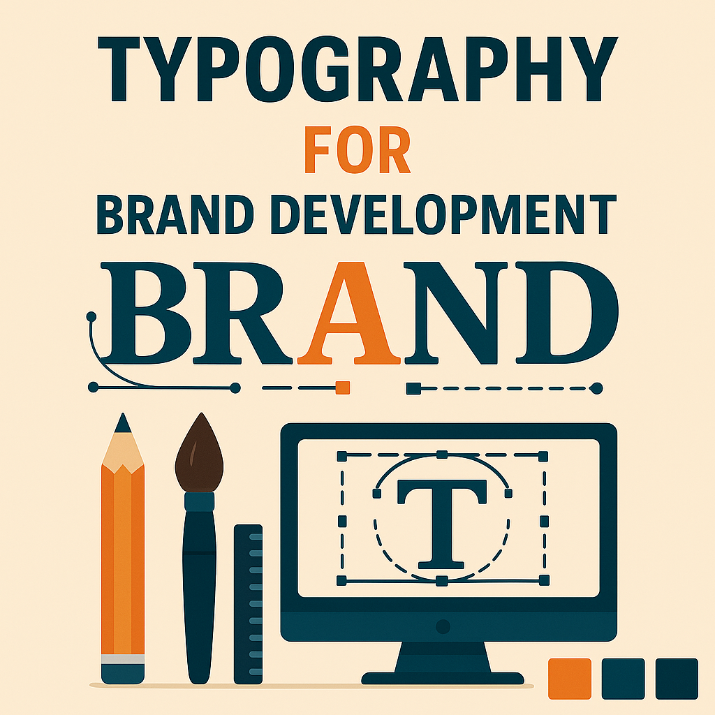
Typography is more than just choosing fonts—it’s about crafting a visual voice for your brand. Fonts convey personality, improve readability, and guide users through your content.
Craft Your Visual Voice
At Delta Design Solutions, LLC, we take typography seriously. We pair fonts that not only look great but also support your brand’s tone—whether it’s playful and creative or clean and professional. From headlines to footnotes, we fine-tune every element to ensure your site is both beautiful and easy to read.
This attention to detail carries through in everything we do, from web design and logo creation to full brand development and photography. And if your existing site is cluttered with too many fonts or lacks typographic balance, our website refresh services can bring clarity and consistency.
Your words matter—let’s make sure they look the part.


2 thoughts on “Typography: Speak Loud and Clear Without Saying a Word”
Typography is indeed a powerful tool for brand identity. The choice of fonts can significantly impact how a message is perceived. It’s fascinating how something as simple as a typeface can influence readability and user experience. I wonder if there are specific fonts that are universally effective for certain industries? Also, how do you balance creativity with functionality in typography? It would be interesting to hear more about the process behind selecting the perfect font for a brand. What’s your take on the role of typography in digital versus print media?
Thank you for your thoughtful questions! I don’t think there are really any universally effective fonts, though there are certainly some that come and go in style. I think it’s more of a question of what tone you want to convey and then picking a font that is pretty widely accepted to carry that tone. For instance, an authoritative font is typically a Serif font like Times New Roman, where a more modern or approachable font is typically Sans Serif like Montserrat. Typography should always in my opinion be more heavily weighed towards functionality than creativity. Font choices should always be readable and not take away from your brand. For instance, overly fancy handwritten type fonts can make it difficult for viewers to read what you are saying. Although they are very creative, they are not functional in that regard. I recommend you read through my other blogs, specifically my Client Highlight pieces to better understand our process for selecting the perfect font! Thanks for reading!