We may be a small business, but we have some big clients! We love working with all of our clients at Delta Design Solutions and are very proud of each custom delivery of products designed to meet their specific needs. This client highlight is from our first big client: Dronenburg Consulting, LLC.
Dronenburg Consulting, LLC
The Story
In April, 2022 I called my Dad as I often do to chat about what’s going on in our lives and to catch up. I was excited to tell him that I had talked with my husband and decided to start my own Small Business with my passion for Web Design and Online Marketing. After sharing my news, he told me he had also been considering starting a consulting business to continue working after he retired from his current position as a Civilian working with the US Navy.
He asked if I wanted to help create his new Brand, Logo, and Website and I jumped at the opportunity!
The Brand
I started by gathering information about the history of the Brand including work experience, qualifications, and other elements that make up the unique story of the Brand. It became clear very quickly that this Brand would need to reflect someone who had a lifetime of unique and specialized experience. It was also very apparent that his service as a Veteran of the United States Navy was critical to his career and experience, and I needed to ensure his Brand communicated that experience effectively and seamlessly.
After discussing these elements further, we decided together that the Brand for his new small business should be focused on conveying:
- Professionalism
- Experience
- Patriotism
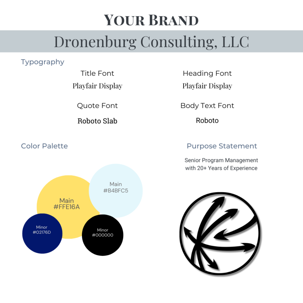
Color Palette
There was no particular guidance provided for a color palette, so I decided to use a palette inspired by his background with the US Navy as well as his technical background and experience.
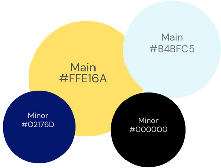
The blue and yellow colors were a subtle nod to the US Navy colors of blue and gold, and the yellow and black combination alluded to a technical background. Colors have a powerful impact on the subtle sub-conscious communication of a brand, so I knew I wanted to make sure that the colors clearly communicated the overall Brand elements.
Dronenburg Consulting, LLC
This was a brand new small business, so my Dad hadn’t even settled on a name yet. We talked about what his immediate goals were for the business, but also his long term dreams as well. He needed the business to be personalized to represent his desire to be a Program Management Consulting business, but he also dreamed of having it be a part of his legacy. He told me he would love to have his children join the business at some point, so he was hesitant to name the business too personally.
Another consideration was that the name ‘Dronenburg’ is both unique and also, well, let’s face it – hard to remember how to spell correctly. He was concerned that including his last name, ‘Dronenburg’ in the name of the business would ostracize him from potential future business because clients wouldn’t be able to remember how to look him up.
We discussed various ideas including shortened versions of his name such as ‘DBurg’ or his initials, ‘JWD’ as brand elements. I researched available domain names, available LLC names in his home state where the business would be established, and provided a list of potential options.
Ultimately, he decided to embrace and lean into the uniqueness of ‘Dronenburg’ and make it a prominent part of his brand. By using ‘Dronenburg’ in the name of the business, it was personalized and met his immediate purpose of being a single-member LLC focused on Program Management Consulting, while also enabling him to leave the business open to becoming a part of his legacy.
The name Dronenburg Consulting, LLC was born.
Typography
Like the color palette, there was no specific guidance given on the typography choices for this brand. I was inspired by the emphasis on professionalism for this brand, especially in Program Management.
Many official documents that are produced use popular Serif Fonts such as Times New Roman, Georgia, Garamond, and Didot (essentially, any Serif Font found in MS Word). With that in mind, I decided that the Title Font and Heading Fonts should be Serif Fonts to communicate professionalism. To compliment these choices, I chose a Sans Serif font for the body text, with a font in the same Sans Serif family for the Quote Font.

Final Brand
The Logo
I partnered with a Graphic Artist for developing the logo, which was a great learning experience for everyone involved. Together, we created a process which we have since honed into our logo design process that we use today.
We first met to discuss goals for the Logo and any ideas or inspiration that we should follow.

We used these sketches to inform a final design concept. We kept the communication stream open and fluid so that ideas could pass between all parties, with lots of comments, feedback, and refinement which in the course of a few days led to the delivery of the final Dronenburg Consulting, LLC Logo.
Photography
With a fully developed Brand including Color Palette, Typography, and Logo decided and delivered, there was only one element missing before completing the project with the new website – a professional headshot. While there were several pictures that were provided to me for use throughout the website, in order to create a personalized feel for the Brand that truly represented the individual, not just the business, the website would need a crisp, edited, and professional headshot.
While I do offer photography services as a part of Delta Design Solutions services, my Dad is not local to Colorado. Instead, I researched and interviewed multiple professional photographers in the greater Washington, D.C. area and partnered with a photographer who drove to my Dad’s house to take his headshots. They were delivered directly to him, and he then sent me his favorites for consideration to use on the website.

The Website
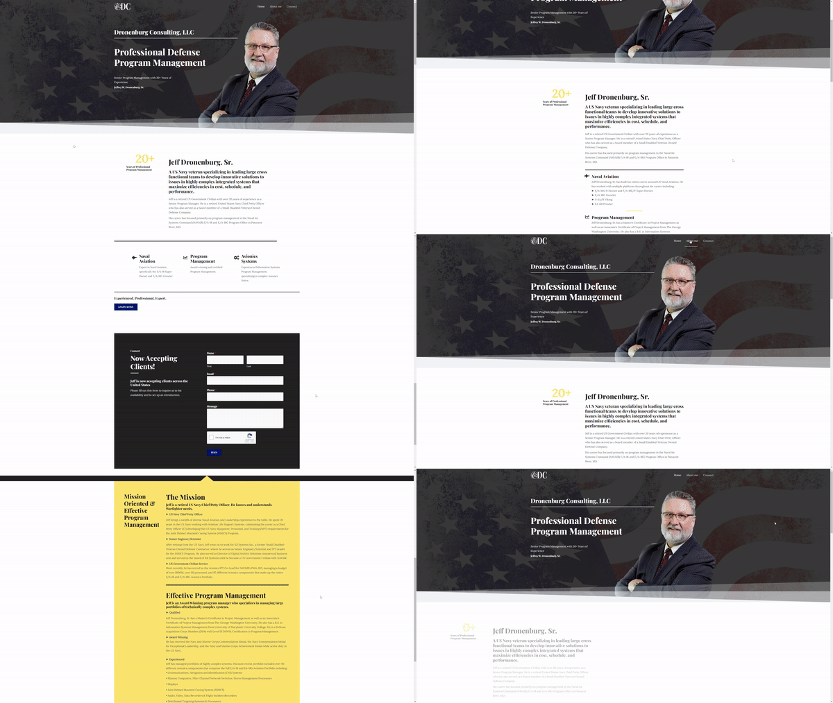
After the Brand, Logo, and Photography services were completed, it was finally time to put together the website! I registered the domain, dronenburgconsulting.com, and built out all the technical elements of the website including professional Email service. Email with a custom domain was very important to this Brand and required some additional technical work including PKI certification support and Encrypted Email communication, among other important security features.
I wanted the design elements of the website to communicate the core elements of the newly formed Dronenburg Consulting, LLC Brand:
- Professionalism
- Experience
- Patriotism
Every highlighted element of the site is designed to reach back to one of these elements.
Professionalism
The overall design for the website was left very minimal and clean with not too many flashy graphics or bold colors. There are also lots of lines breaking up blocks of text, headline text reminiscent of an official document publication, and only a small number of pages included in the website.
Experience
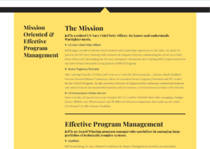
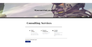
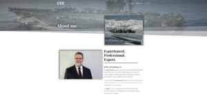
I wanted the overall website to read almost as a digital version of a resume. I took special care to clearly summarize all the various experiences and qualifications that needed to be communicated to potential clients to really showcase the Dronenburg Consulting, LLC Brand. I used graphics to show the number of years of experience, and included taglines like ‘Experienced. Professional. Expert.’ throughout the website to speak directly to the depth of experience found in this Brand.
Patriotism
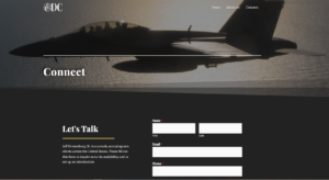
Service to the United States both as a military member and as a civilian are important parts of this Brand. The target customer audience are US Defense Contractors, so including design elements that communicated this dedication to service of the United States was critical to this Brand. I used personal pictures of US Naval Aircraft that my Dad has worked with in the past as well as an American Flag in the header of the website to clearly communicate the Patriotism element of this Brand.
- All
- Professionalism
- Experience
- Patriotism
The End.
This was (and still is) one of my favorite projects that I’ve worked on since starting Delta Design Solutions. I was able to design a completely new Brand including all the Name, Color Palette, Typography, Photography, Logo, and Website. It was such a joy to be an integral part of my Dad’s journey to starting his own business, and by being my first customer, he was also an integral part of my own journey to starting Delta Design Solutions. His choice to work with me afforded me the opportunity to learn in a safe and forgiving environment with a client who was honest with me throughout the entire process and provided solid and sound feedback as we both learned and grew through the experience.
Thank you so much, Dad for working with me on this project! Oh, and by the way, it’s almost time for a Website Refresh. Have your people call my people.


