The colors you choose for your brand do more than make your business look good—they can communicate personality, influence perception, and make your business more memorable. From Coca-Cola’s iconic red to Tiffany & Co.’s signature blue and Starbucks’ recognizable green, this post explores how intentional color choices can create a cohesive brand and strengthen your online presence.
The Colors of Your Brand: How Color Shapes Recognition and Connection
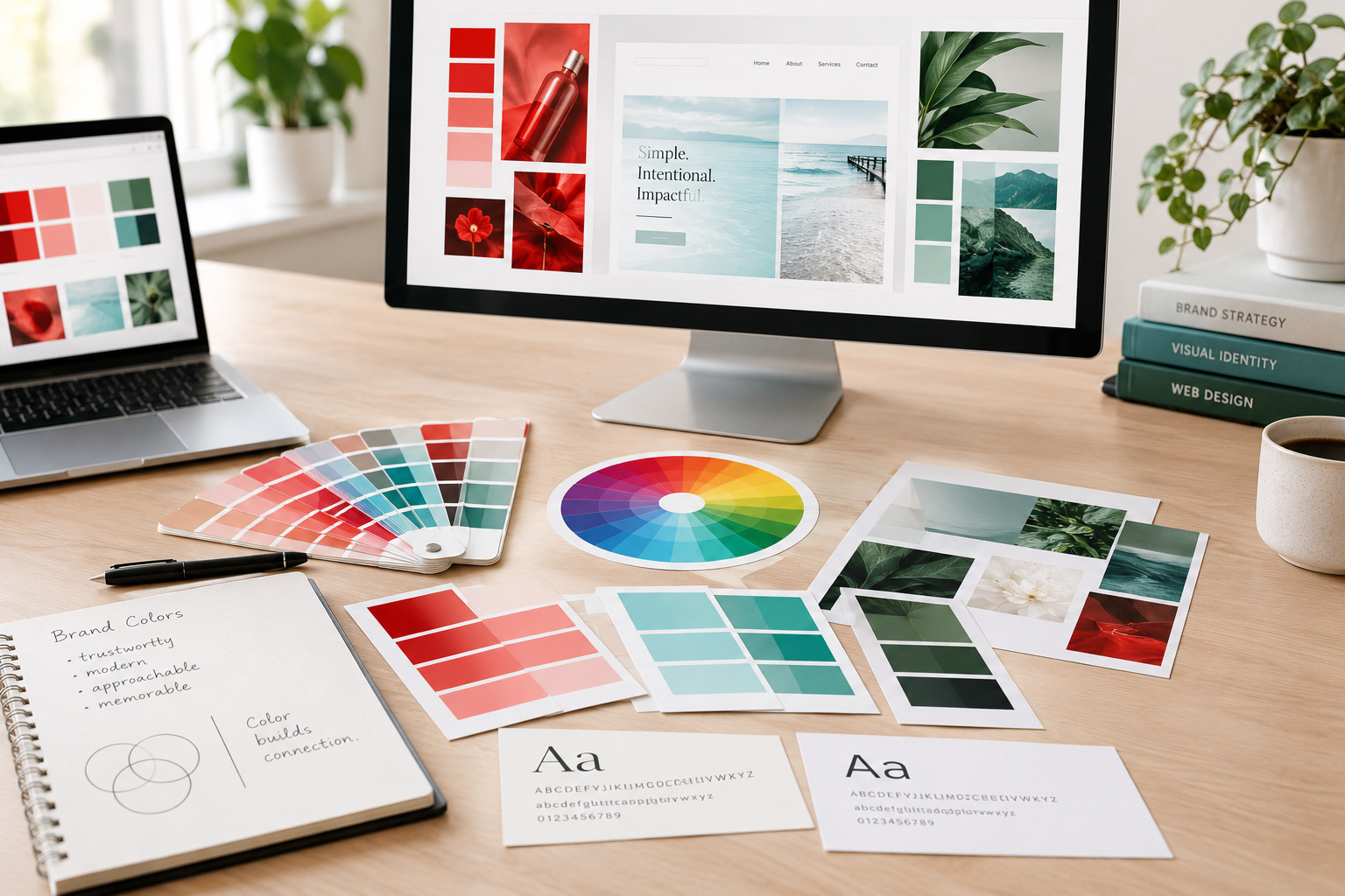
When developing a brand, color is often one of the first things people notice. Before someone reads your tagline, explores your website, or learns about your services, your color palette is already communicating something about your business whether you realize it or not. That’s why choosing brand colors is about more than simply picking your favorite color. The right colors can help communicate your personality, create an emotional connection, and make your brand more recognizable.
At Delta Design Solutions, we really emphasize the application of color theory in developing your brand because we know that color is an important part of creating a cohesive visual identity that represents your business and connects with your audience.
Color Can Influence How People Feel
Different colors can evoke different emotions and associations. While color psychology isn’t a strict set of rules, certain colors have developed common associations over time.

Consider Coca-Cola. Its iconic red-and-white combination has been part of the brand’s visual identity for generations. Red can communicate energy, excitement, confidence, and boldness—qualities that fit naturally with Coca-Cola’s energetic and approachable personality.

Now consider Tiffany & Co. Its distinctive robin’s-egg blue has become so closely associated with the luxury brand that Tiffany Blue® is a registered color trademark. The color has been consistently used throughout the company’s packaging and branding, becoming almost as recognizable as the Tiffany name itself.
These examples demonstrate something important: color becomes powerful when it consistently supports the story a brand is trying to tell.
Your Color Palette Should Fit Your Brand
While there are some industry standards and distinct reactions colors can bring, there really isn’t a single “right” color for every business. Imagine a luxury interior design company using bright neon colors or a children’s activity center using a muted corporate gray palette. Neither is necessarily wrong, but the colors may not communicate the personality customers expect from those businesses.
A great example is Starbucks. Its familiar green would normally be associated with recycling, nature, or other more industrial brands – maybe not a coffee shop! But, even then, it has become a central part of the company’s identity and is closely associated with the brand’s stores, cups, signage, and marketing. The color helps create a recognizable visual experience whether you’re seeing a Starbucks storefront across the street or a cup sitting on someone’s desk.
Similarly, your brand colors should support your personality, audience, industry, and positioning. Are you modern and sophisticated? Friendly and approachable? Bold and energetic? Natural and relaxed? Your color palette can help communicate those qualities before a potential customer ever reads a word about your business.
Consistency Builds Recognition
Coca-Cola, Tiffany & Co., and Starbucks have something else in common: consistency.
You don’t always need to see the company name to recognize these brands. Their distinctive colors have become visual shortcuts that help people identify them. That’s the goal of effective brand development. Your website, social media graphics, business cards, signage, advertising, packaging, and other customer touchpoints should feel like they belong to the same brand.
Imagine seeing a company’s website in one color palette, its social media posts in another, and its printed materials using completely different colors. Even if each piece looks attractive on its own, the overall brand can feel disconnected. A consistent color palette helps create a cohesive experience and makes your business easier to recognize.
Color Matters in Web Design, Too
Color doesn’t just influence your logo or printed materials. It plays an important role in website design and user experience. Your brand colors can help establish visual hierarchy, highlight important information, separate sections, and draw attention to calls-to-action. For example, an accent color can be used strategically for buttons or links so visitors can quickly identify where they should click. Background colors can create visual separation, while contrasting colors can make important content easier to notice.
Think about how Starbucks carries its recognizable green throughout many parts of its customer experience. The color isn’t limited to the logo—it becomes part of the overall visual language.
Your website can do the same thing. This is where branding and web design come together. Your website shouldn’t just look good—it should feel like a natural extension of your overall brand.
Don’t Try to Follow Trends
Color trends come and go. What’s popular today may feel dated a few years from now. While current design trends can provide inspiration, your brand shouldn’t be built entirely around what’s fashionable at the moment.
Tiffany & Co. is a great example of the value of longevity. Its signature blue has remained an important part of its identity for generations. Coca-Cola’s red has similarly remained recognizable even as the company’s broader visual identity has evolved.
The lesson isn’t that every business needs a timeless color like red, blue, or green. It’s that your color palette should be chosen intentionally rather than simply because a particular color happens to be trending. At Delta Design Solutions, I believe the goal is to create a visual identity that feels current while still being authentic to you. Your colors should work for your brand—not simply because they’re popular on social media or appearing everywhere in design galleries.
The Right Colors Tell Your Story
There isn’t one universally “best” color palette. The right combination depends on the story you want your brand to tell and the people you want to reach. Coca-Cola’s red helps reinforce a bold and energetic identity. Tiffany’s signature blue has become closely connected to luxury and heritage. Starbucks’ green has become an instantly recognizable part of its brand experience.
These companies demonstrate that color can become far more than decoration. It can become part of the identity customers remember. A thoughtful color palette can make your business feel more professional, create consistency across your marketing, strengthen recognition, and help your customers connect with your brand.
At Delta Design Solutions, I can help bring those visual pieces together—from color selection and branding to website design—so your business has a cohesive and professional presence.
Your brand has a story to tell. The right colors can help tell it before you say a single word.